The other day I was just trying to buy insurance from a government insurance website and realized what a cumbersome website it has become. It snoozed at the speed of snail and the lousy graphic made me shut it down. No wonder why people don’t use their website. So for the benefit of today’s generation I am compiling a couple of pointers which denotes that you have been lagging beyond time in sense of website design. Do check out and see it for yourself if you fit any of the points. If you do, it not too late to step up mate!
Table of Contents
ToggleWebsite Expectations Have Changed in 2026
Modern websites are no longer judged only by appearance. Users today expect fast-loading pages, mobile-first navigation, AI-friendly layouts and frictionless browsing experiences across every device.
A visually attractive website alone is no longer enough. Businesses now need websites that build trust, improve usability and support search visibility in both traditional and AI-powered search environments.
-
The fonts you use yell “ Hello Y2K”
As a web designer you must be aware of the latest trend. You should be courageous to follow the trend no matter how bizarre it is. If you are still using a Times New Roman font in your page, you repel users. Use the snazzy new typography that is widely available.
Typography Trends in 2026
Modern typography now focuses heavily on readability across mobile devices and responsive screen sizes. Variable fonts, cleaner spacing and accessibility-friendly text layouts are becoming increasingly important for user experience and website performance.
-
You are overusing the modern available typography
Well, there is a saying that classics never age. Its works fine most times. If you are using only handful next gen typography very frequently, you may lose your edge. You need to utilize the vast pool of fonts available wisely. You may even set back to old basic fonts if your brands connect with it.
Minimalist Typography and Brand Identity
In 2026, businesses increasingly use fewer but more intentional typography choices to create cleaner and more recognizable brand experiences. Simplicity and consistency now matter more than excessive visual experimentation.
-
Your brand logo looks like a figment of random thoughts!
Sometimes you try to make your logo look uber chiq and end up with a meaningless old logo. It is pointless to have a logo that doesn’t stand out from the rest. The logo should bring out the essence of your brand and can connect with the audience. A hipster logo with no brand connect is strict no –no.
Modern Branding Expectations
Today’s users expect logos and branding systems that work seamlessly across websites, mobile apps, social media profiles and dark-mode interfaces. Scalable, clean and recognizable brand identities have become more important than visually complicated designs.
-
Background Videos
Gone are those days of silly animation and gif images that made your website cumbersome. A background video brings a lot of attention to your webpage. They can explain your wide content in a short span of time in a significantly receptive way. A good background video can entice your viewer and give him a lot more information without having read a single word about your website.
Your Website Is Not Mobile-First
Mobile-first design has become a standard expectation in 2026. Websites that still prioritize desktop layouts often create frustrating experiences for smartphone users.
Modern websites now use:
- thumb-friendly navigation
- sticky CTA buttons
- responsive layouts
- simplified mobile menus
- app-like browsing experiences
Businesses that ignore mobile UX often experience higher bounce rates and lower conversions.
Performance-Optimized Video Experiences
While background videos still improve engagement, modern websites now prioritize lightweight video formats and optimized loading performance. Slow-loading media can negatively impact user experience, mobile usability and SEO rankings.
-
Move over 3D template. Welcome semi Flat designs
With the advent of iOS4.2 apple has fundamentally worked its interface on a semi flat design. The flat and semi fat designs look neat, aesthetic and user friendly. The combination of semi flat design with neutral colors and a neo font will work wonders for your website.
Modern UI Design in 2026
Modern interfaces now combine minimalism with subtle depth, micro-interactions and clean motion effects instead of relying heavily on purely flat aesthetics. Businesses increasingly focus on intuitive and conversion-focused UX design systems.
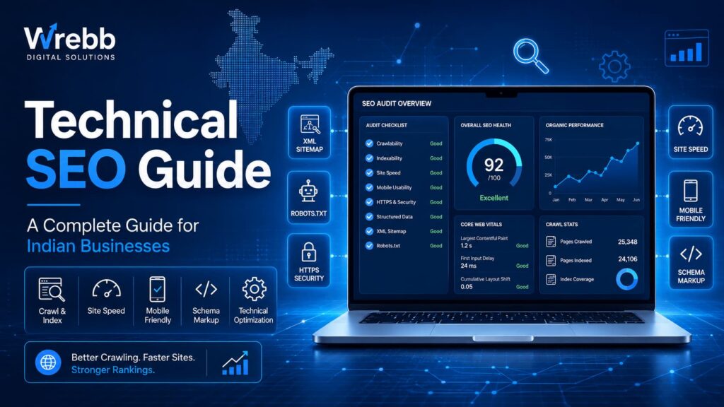
Your Website Loads Too Slowly
Website speed has become one of the most important user experience and SEO factors. Slow-loading websites negatively impact engagement, conversions and search visibility.
Modern users expect websites to load almost instantly across both desktop and mobile devices. Businesses now optimize code, media files and hosting infrastructure to improve performance.
-
You are using grainy images
Low resolution images went out of style some 7 years ago. Use high resolution product images that giver your viewer the clarity of your product and the courage to trust your brand.
Visual Quality and Web Performance
High-quality visuals remain essential in 2026, but businesses also optimize image formats carefully to improve page speed. Modern websites often use next-generation image formats and responsive media systems for faster loading across devices.
-
Click on the animation to enter the website
Man, I can’t even explain how lame is clicking animation before entering a webpage. It’s not the 90’s anymore where people enjoy silly animations. It’s definite trait that you must avoid.
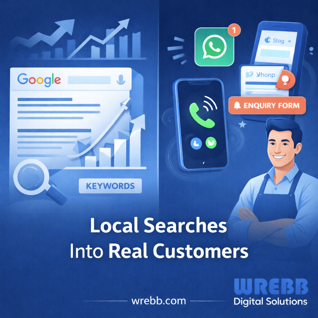
Frictionless User Experiences Matter More
Modern users expect immediate access to information without unnecessary interaction barriers. Businesses now focus heavily on reducing friction, simplifying navigation and improving accessibility throughout the browsing journey.
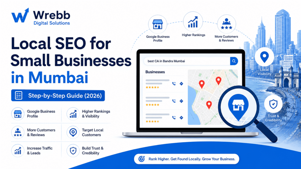
Your Website Is Not Optimized for AI Search
Modern websites must now communicate effectively with AI-powered search systems and conversational search platforms. Poorly structured content, unclear hierarchy and outdated layouts reduce discoverability in AI-driven search experiences.
Businesses increasingly optimize websites using:
- structured headings
- FAQ sections
- semantic layouts
- scannable content blocks
- GEO-friendly formatting
Your Website Lacks Accessibility Features
Accessibility has become an important part of modern website design. Businesses now focus on readable typography, color contrast, keyboard navigation and screen-reader compatibility to improve usability for all visitors.
Accessible websites often provide better user experiences and stronger SEO performance.
Your Website Still Looks Generic
Modern consumers expect personalized and brand-specific digital experiences. Generic templates and outdated layouts often reduce trust and make businesses appear less credible.
Custom UI elements, thoughtful branding and user-focused experiences now help businesses stand out more effectively online.
FAQs
How do I know if my website design is outdated?
An outdated website often has slow loading speeds, poor mobile usability, inconsistent branding, low-quality visuals and cluttered navigation that negatively affect user experience.
Why is mobile-first website design important in 2026?
Most users now browse websites primarily through smartphones. Mobile-first design improves usability, engagement and conversion rates across smaller screens.
Does website speed affect SEO rankings?
Yes. Search engines consider website performance and loading speed important ranking factors because slow websites often create poor user experiences.
What are the modern website design trends in 2026?
Popular website design trends include minimalist layouts, mobile-first UX, AI-friendly structures, accessibility-focused design, micro-interactions and performance-optimized visuals.
Why are high-quality images important for websites?
Professional visuals improve trust, product perception and overall brand credibility while helping businesses create more engaging browsing experiences.
What is GEO-friendly website design?
GEO-friendly design focuses on structuring websites in ways that improve visibility and extractability for AI-powered search systems and conversational search platforms.
Why should businesses avoid outdated animations?
Excessive or outdated animations can slow down websites, create navigation friction and negatively affect user engagement on modern devices.
How often should businesses redesign websites?
Many businesses refresh or redesign websites every few years to keep up with evolving user expectations, technology standards and search engine requirements.
If you have any web design/development queries related to your website, online store or your app then we are here to assist you.
Wrebb offers top of the line web design, web development services and mobile app development expertise. Our diverse experience across multiple industry verticals makes us a good fit for your website, e-commerce store and mobile app development needs. Kindly contact us for more details.